WAKA

WAKA

© 2026

(REAL ESTATE)

(BRANDING)

(MOTION)

WAKA

© 2026

(REAL ESTATE)

(BRANDING)

(MOTION)

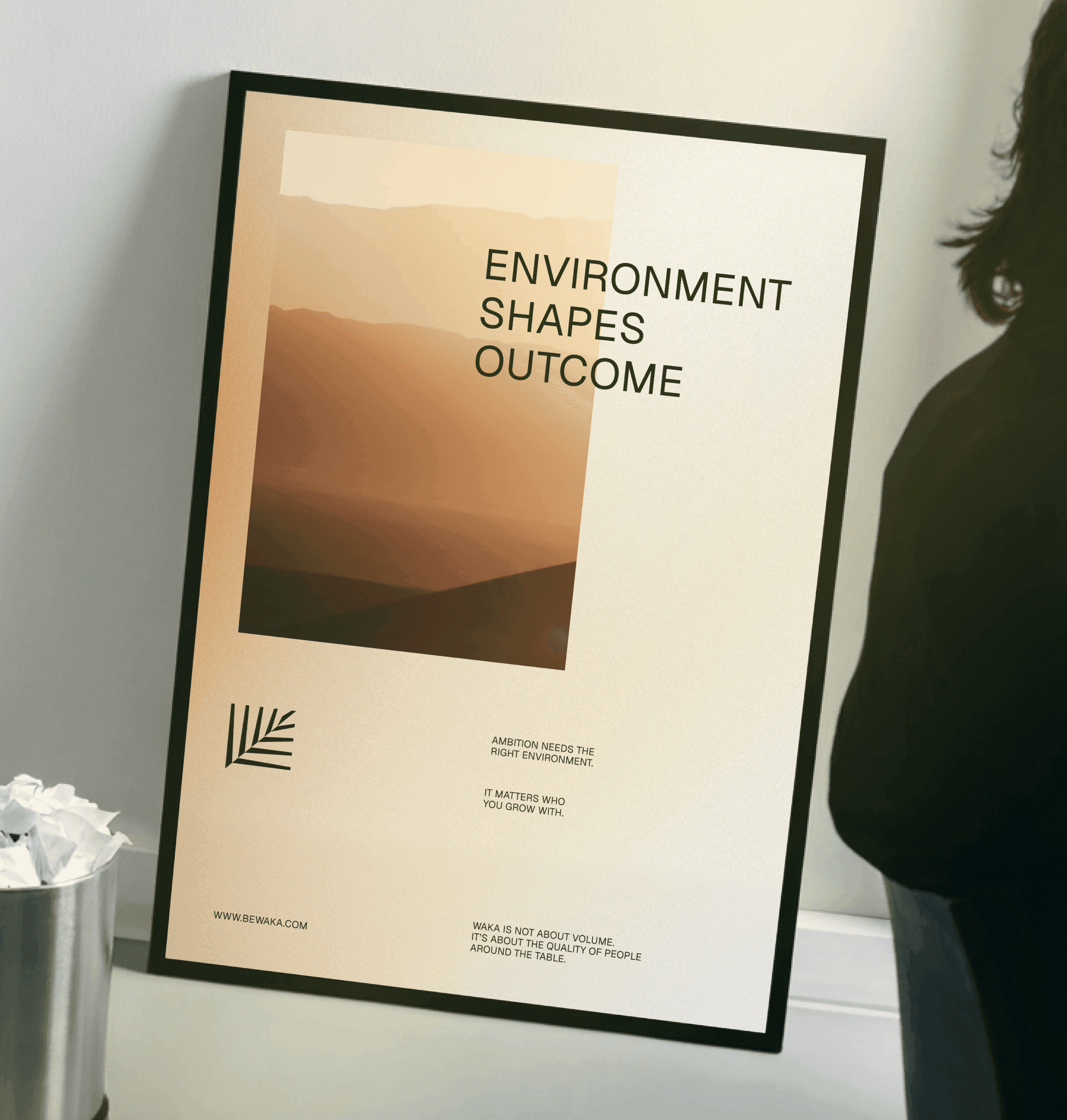
                                       For Waka, a selective circle of real estate investors and partners, we built a complete brand — quiet, confident, and shaped by the idea that environment shapes decisions.
                                       For Waka, a selective circle of real estate investors and partners, we built a complete brand — quiet, confident, and shaped by the idea that environment shapes decisions.

(01 INTRO)

(01 INTRO)

(industry)

Real Estate, Investment

(industry)

Real Estate, Investment

(strategy)

We built the brand around one idea: environment shapes decisions. The name draws from Wanaka, New Zealand, and the symbol from the native Silver Fern — giving the identity a quiet, grounded confidence.

(strategy)

We built the brand around one idea: environment shapes decisions. The name draws from Wanaka, New Zealand, and the symbol from the native Silver Fern — giving the identity a quiet, grounded confidence.

(the team)

Václav Šrámek (Design) Nina Kubáčková (PM)

(the team)

Václav Šrámek (Design) Nina Kubáčková (PM)

(the team)

Václav Šrámek (Design) Nina Kubáčková (PM)
Waka_1
Waka_2
Waka_3
Waka_4
                                               We translated the identity into a visual system built for a select audience — calm, confident, and consistent across every touchpoint, from the logo to the smallest detail.
                                               We translated the identity into a visual system built for a select audience — calm, confident, and consistent across every touchpoint, from the logo to the smallest detail.

(02 DIGITAL PRODUCT)

(02 DIGITAL PRODUCT)

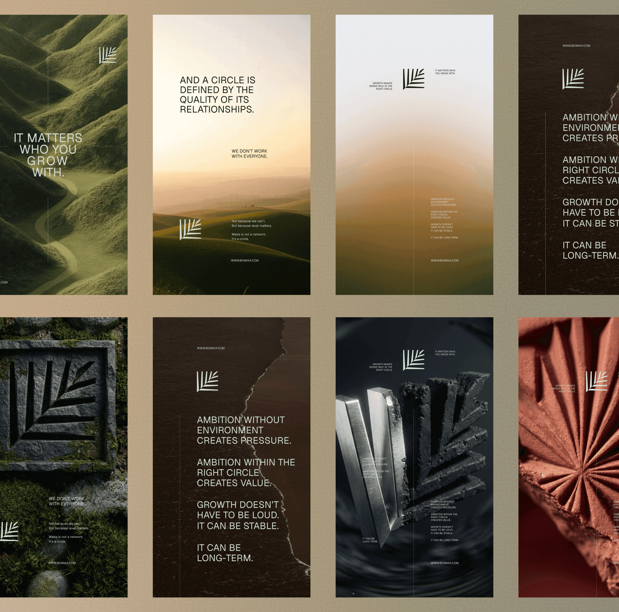
                                               The identity speaks through landscapes, mist, stone, metal, and terracotta in earthy tones, paired with restrained typography and quiet messaging — a brand that doesn't need to be loud.
                                               The identity speaks through landscapes, mist, stone, metal, and terracotta in earthy tones, paired with restrained typography and quiet messaging — a brand that doesn't need to be loud.

(03 BRAND TOUCHPONTS)

(03 BRAND TOUCHPONTS)
Waka_6
Waka_7
Waka_8
Waka_5

NEXT

PROJECTS

BF

More of our

creative stuff

More of

our creative

stuff

More of our

creative stuff

NEED CONVINCING?

NEED CONVINCING?

Explore our work and see

how we turn ideas into solutions.

Explore our work and see how

we turn ideas into solutions.

menu

menu